Simpocracy is an up and coming company whose goal is to create an easier way to understand what is going on in the political world, as well as explaining news stories without as little bias as possible. I was asked to refresh the company's brand identity including a new logo, color palette and web design reflect the company's modern & simplistic intentions and direction. Below is a sample of that brand identity.
This is a very fresh start for the company and the website is still in development, however you can see the early beginnings at Simpocracy.com
This is a very fresh start for the company and the website is still in development, however you can see the early beginnings at Simpocracy.com
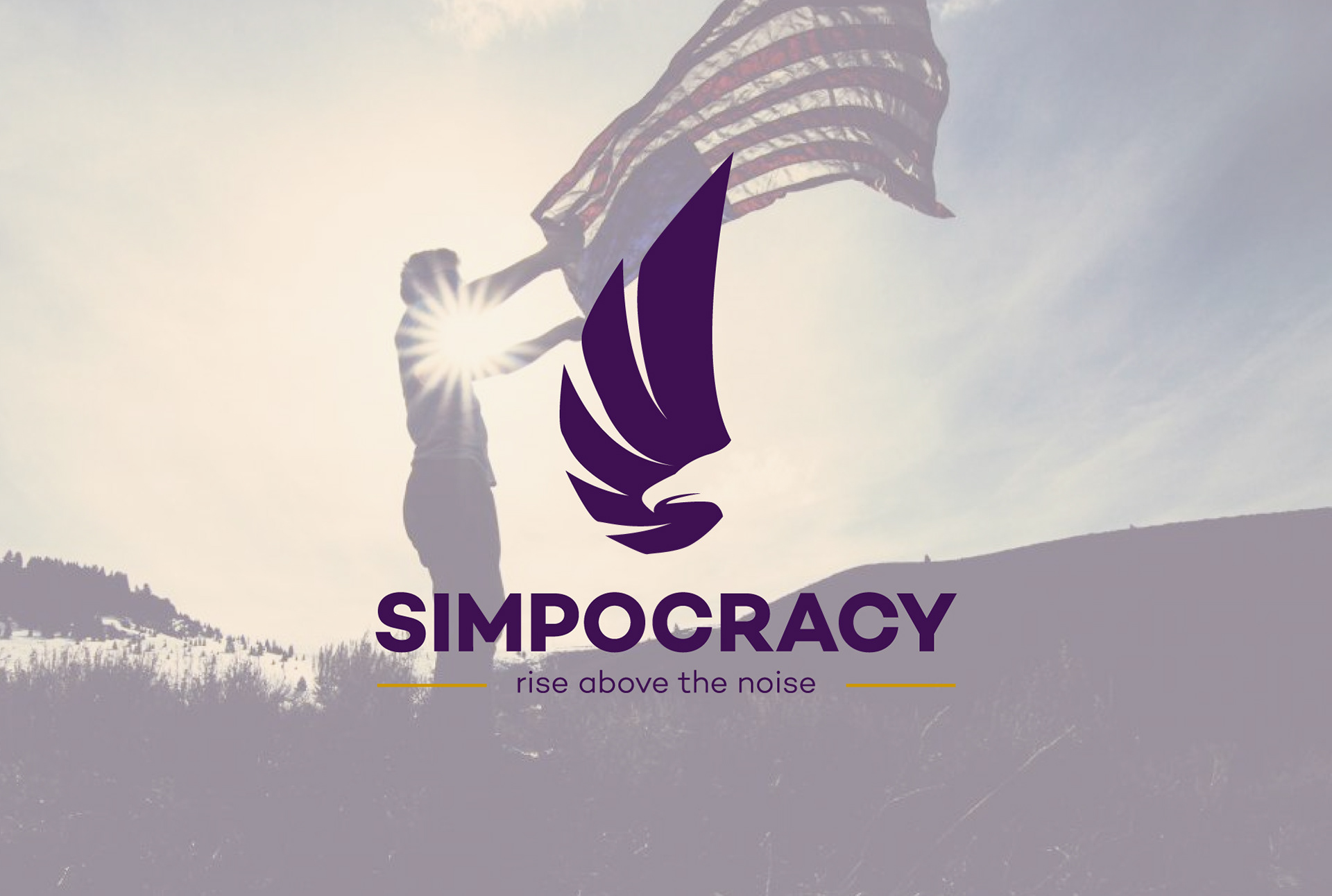
Below is the original logo that started from a podcast. The client was looking for something that was more sleek, confident and less detailed, so that it could be used on multiple platforms so that they could expand their brand. They still wanted to use a phoenix as the overall mark because, as the slogan states, they want to show that they 'rise above the noise' of bias in media and throughout the political world just as a phoenix rises from the ashes. They also wanted to continue using the color purple (a mix between republican red and democratic blue). We landed on this mark which uses negative space to create the phoenix and matches the slogan with the motion of the wing creating the viewer to rise up with it.


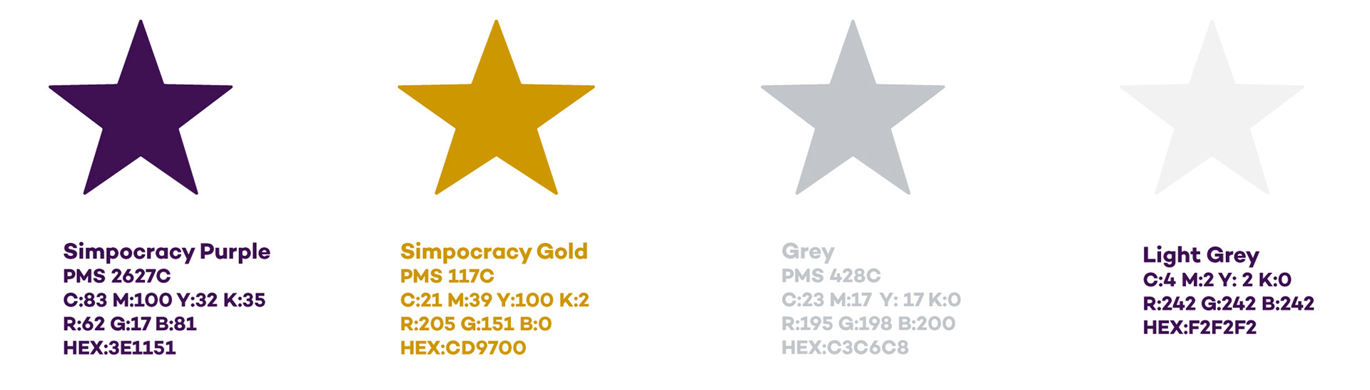
With the logo, I created a color palette to accompany the mark. As stated before they wanted to continue with the purple but I want to accompany it with another bold color in the gold to represent strength and give a few secondary colors to make a consistent palette throughout.
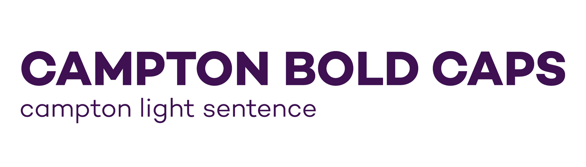
I also gave the brand a new typeface that matches the overall simplicity of the company. Originally, there was no font used consistently. Campton is a strong and clean san serif that ties the brand together and gives a confidence to the company.
I also gave the brand a new typeface that matches the overall simplicity of the company. Originally, there was no font used consistently. Campton is a strong and clean san serif that ties the brand together and gives a confidence to the company.
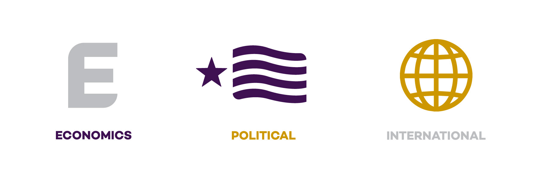
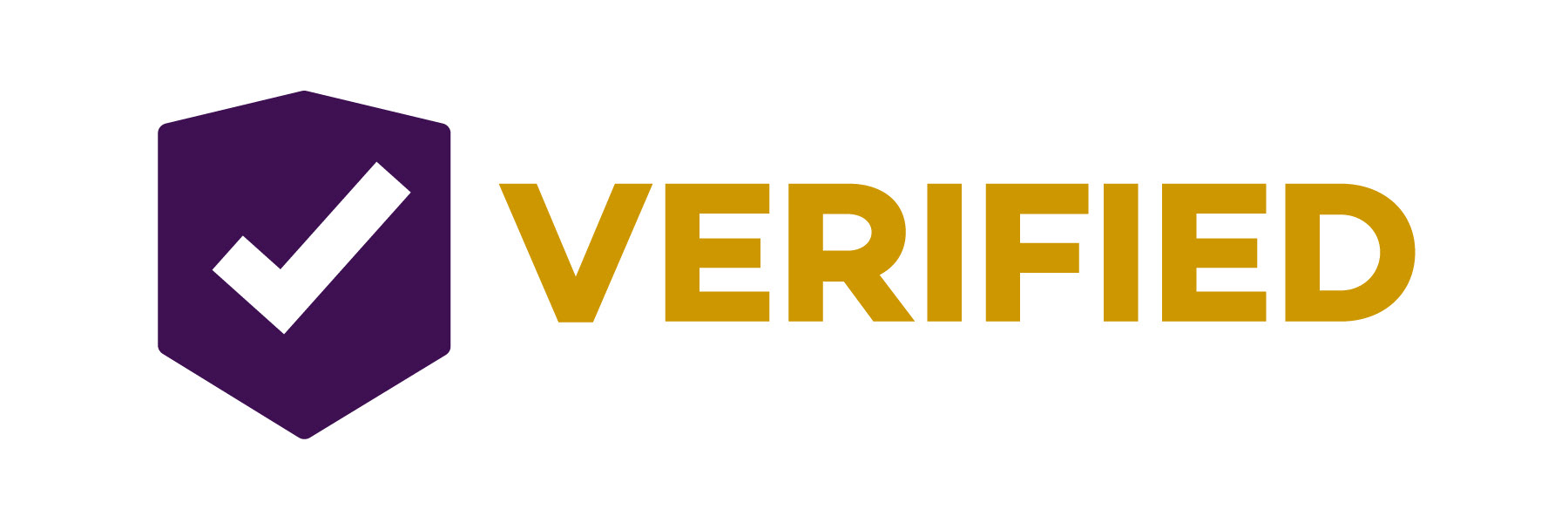
Below are a set of icons and an 'un-bias' verification logo that the client intends to use on different stories they will be posting. These icons are clean and help support the overall brand recognition.